SheLaunch Mobile App
CASE STUDY
A digital community space designed to help, guide, and encourage women struggling to get back to work following a career hiatus.
Industry
Design / Education
Duration
8 Weeks. May-Jun
Role
UX Researcher
UI Designer
Tools
Miro
Figma
design process
Research
Ideate
Design
Test
Takeaway
Problem
Women who feel vulnerable about career/life transitions, need to return to professional life after an intentional or circumstantial hiatus or a professional gap but face issues with the lack of guidance for the latest advancements, competitions & uncertainties.
Solution
I opted to create an informational learning app tailored for women, serving as a supportive community to empower them in their journey back to work. The goal was to provide a platform where women could access valuable information and virtual resources, including:
Job Search
Education
Career Change
Entrepreneurship
1. Research
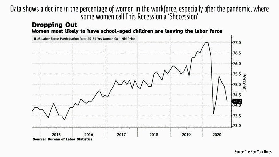
Hundreds of Thousands of Women Drop out of the Workforce every year
2. Ideate
2.1 Card Sorting
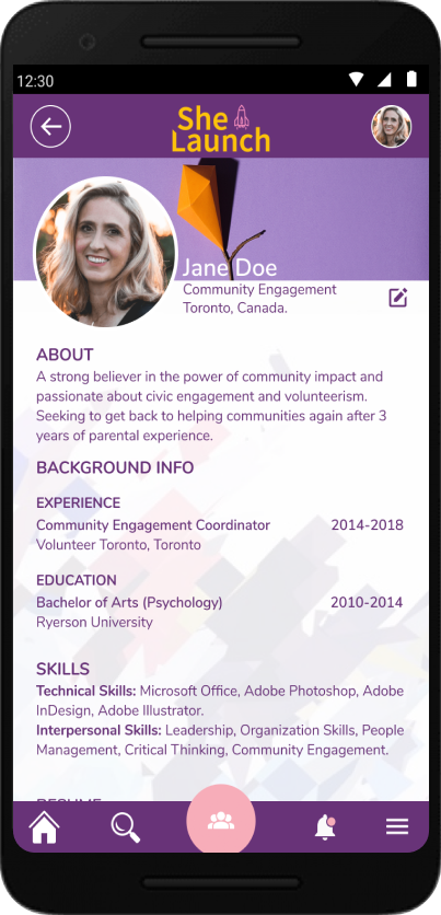
I aimed to align the site's information architecture with user needs by creating a user-friendly navigation structure. After organizing the data, I established 3 main categories with 4-6 subcategories each. Subsequently, I divided one category, resulting in a total of 4 main categories.

2.2 User Flows
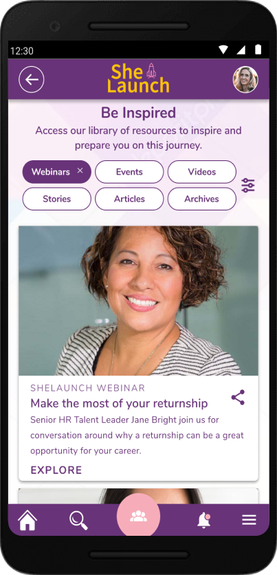
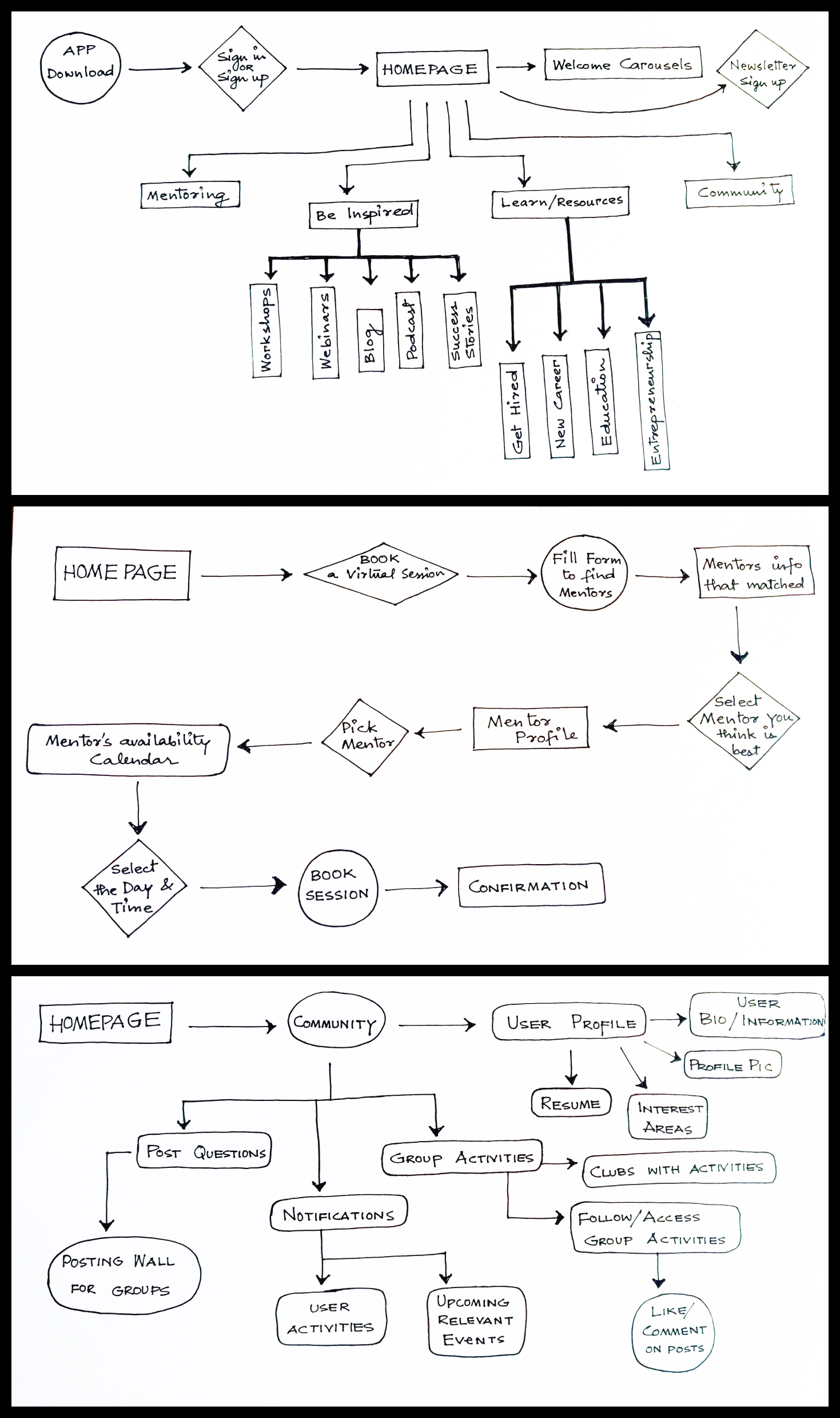
a. User Flow 01 - The first User Flow outlines the Homepage's functionality, detailing accessible features, and extends to the 'Be Inspired' and 'Learn/Resources' pages to explore available features further.
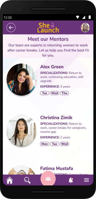
b. User Flow 02 - The user can select and book Virtual Sessions with matching Mentors from a filtered list, based on availability.
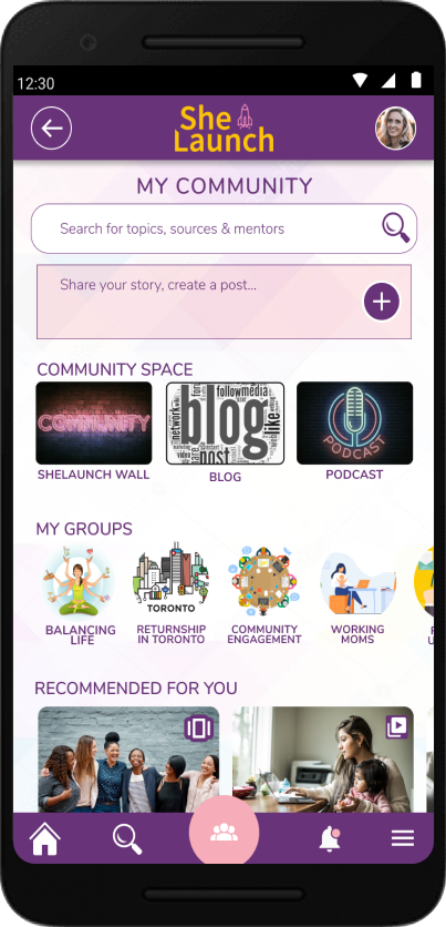
c. User Flow 03 - The third user flow demonstrates a feature allowing users to engage with the community by creating profiles, posting questions, and commenting. Users can also access notifications, activities, and upcoming events from their profiles.
2.3 Site Mapping

Site mapping is always important - it gives designers a bird's eye view of the product, and it shows how pages are prioritized, linked, and labeled. I worked to pan out the sitemap based on the user flows.
2.4 Sketching Wireframes
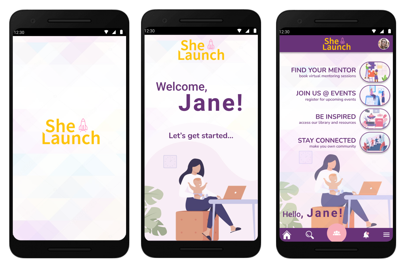
Using Figma, I translated my first sketches into low-fidelity wireframes. Then, I improved them by adding a few relevant stock images and copies provided by the marketing team. At this stage, the wireframes were defined enough for some user testing.

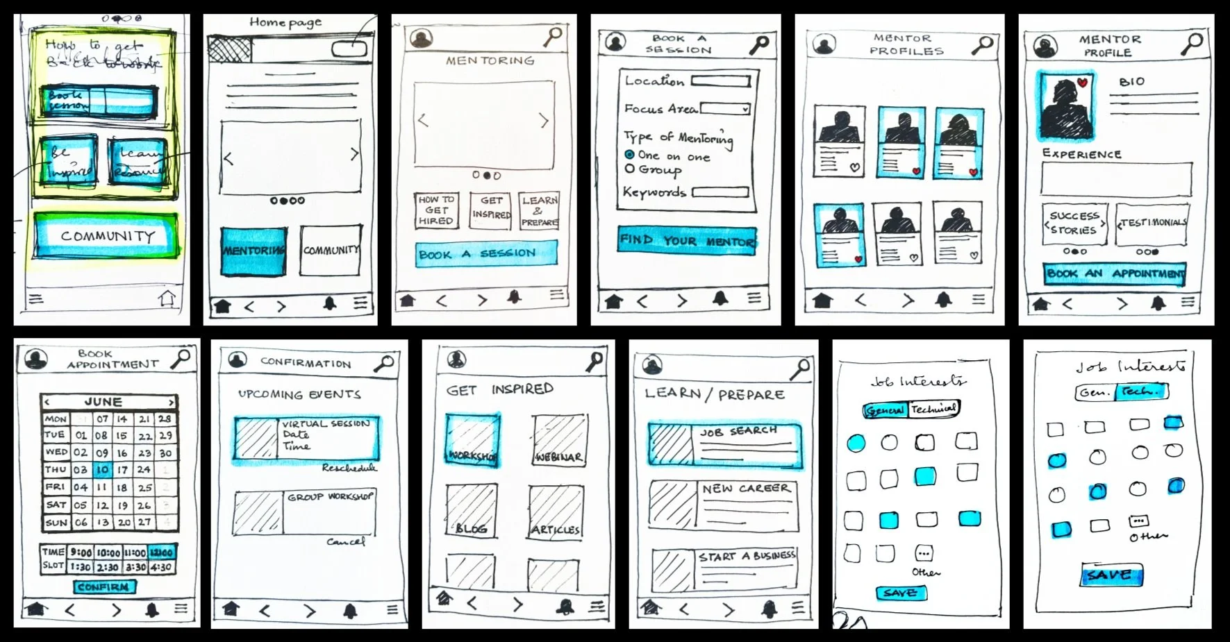
2.5 Low-fidelity Wireframing

The subsequent stage involved transforming wireframe sketches into Low-fidelity digital representations using Figma to visualize the app's layout.
2.6 A/B Testing
Next, I conducted 'A/B Testing,' which helped me discern visual elements that were effective and those that were not. This process provided insights into which color schemes, fonts, and spacing resonated with my target users, informing design decisions for optimal user appeal.

3. Design
3.1 Mid-fidelity Wireframing

The 'Mid-Fidelity Wireframes' facilitated the initial visual analysis of the app's aesthetics and content.
3.2 Moodboard
Design clarity became evident during the creation of the 'Moodboard' for the project. This tool was instrumental in finalizing the app's aesthetic and its appeal to the target demographic. Researching other projects emphasized the importance of consistency, guiding decisions on Avatars, Logins, Categories, Iconography, Typography, and more. Choosing 'Purple' as the primary color stemmed from an understanding of its association with women's empowerment and other positive connotations. To balance the boldness of purple, a light pink was introduced. This process laid a solid foundation for subsequent design steps.

3.3 Design Style Guide
The creation of the 'Design Style Guide' was imperative to maintain consistency and coherence across all design elements within the project. Acting as a comprehensive index or legend, this guide provided detailed specifications and guidelines for typography, color palette, iconography, spacing, and other visual elements. By adhering to the standards outlined in the style guide, I could ensure that every aspect of the design remained aligned and cohesive throughout the project.

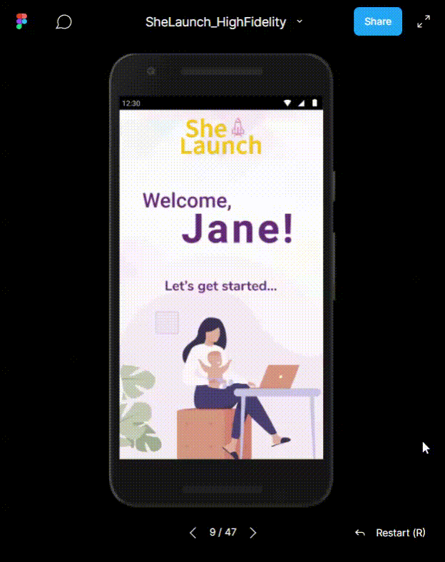
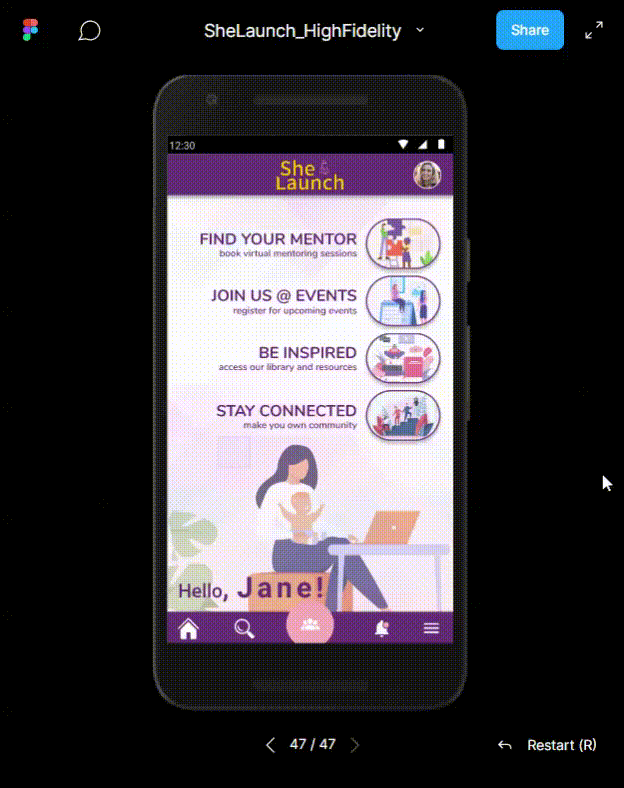
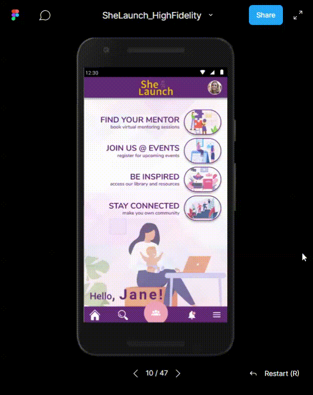
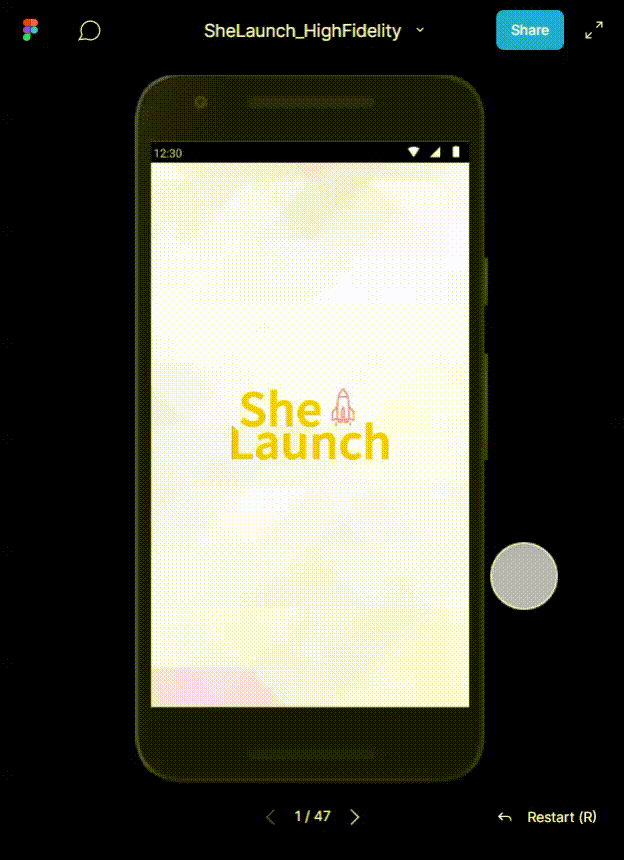
3.4 High-Fidelity Wireframes and Prototyping
Once the ‘High-Fidelity Wireframes’ and ‘Prototype’ were shared with others at each step, every single feedback was important. The prototype helped to improve the navigation flow and enhance the user experience.


4. Test
4.1 Usability Testing
Though I sought feedback from friends during every step of the Figma prototype, the 'Maze Usability Testing' was pivotal. I used Maze to run my usability test on the prototypes, and there were a total of 13 responses. The participants were asked to perform 5 tasks and they were asked to answer follow-up questions about the task and their experience of doing them.
Analyzing heat maps and clickable areas led to clearer and more legible design elements, user-friendly placement of icons and buttons, and insights into navigation flow improvements based on page duration.


5. Takeaway
Iterative Design Process: The course emphasized an iterative approach to visual design, starting from problem identification and progressing through various stages such as user flows, wireframes, and prototypes. Each iteration incorporated feedback and testing to refine the design.
User-Centric Design: The design decisions were guided by user input and research, ensuring that the app addressed the needs and preferences of the target demographic—women re-entering the workforce.
Importance of Feedback: Regular feedback sessions, including peer reflections and usability testing, played a crucial role in improving the app's design. The feedback helped identify areas for improvement and guided design decisions.
Collaboration and Communication: Collaborating with peers and communicating effectively were essential aspects of the course. Working with different partners provided opportunities to learn from each other's projects and contribute to their development.
Continuous Learning: The course provided a platform for continuous learning and self-discovery in the field of visual design. While there is still room for improvement, the experience was satisfying and contributed to personal and professional growth.