DIVVY’s Bike Rebalancing Challenge
CASE STUDY
DIVVY
A Chicago-based bike-share program that features nearly 6,000 bicycles and more than 600 docking stations.
Problem
Divvy's current challenge lies in effectively redistributing bikes across its network to match consumer demand. Our task was to craft an analysis plan to assist Divvy in addressing this bike rebalancing challenge, as illustrated on the right.
Solution
This case study showcases the end-to-end process of storytelling through data visualization using a wide variety of tools to defeat Divvy’s bike rebalancing challenge.
To initiate the creative process, we began by defining the objectives of the analysis project, identifying necessary data sources, extracting insights from the data, uncovering patterns and connections, and transforming these findings into actionable insights. We then crafted data visuals to effectively communicate our insights to Divvy's executive team, ensuring all key elements of the story were conveyed.
data visualization process
PLAN
(Goal)
COLLECT
(Information)
ANALYZE
(Story)
REPORT
(Visual Form)
Industry
Sustainable Transportation
Duration
6 Weeks. Apr-May, 2023
Tools
Data Analysis: Excel, Tableau, R/Python
Presentation: Google Slides, PowerPoint

1. Planning a Data Story
We began by creating a plan to guide us through an analysis that would help Divvy address the bike rebalancing challenge by using the Barbara Minto Pyramid Principle.
The plan clearly expressed the hypotheses, articulated the important questions to be investigated, and identified the data to be collected.
The clarity of the plan allows the team to operate as efficiently as possible through the initial steps of the analysis journey, which can be a confusing and frustrating part of any project.
2. Conducting Data Analysis
We used a blend of basic tools (spreadsheets, dataviz, and presentation software) and advanced tools (SQL along with R or Python) to discover, lift, and present data stories from the available volume of data.
Using software tools to gather and analyze data, we performed exploratory data analysis to look for patterns in the data that indicated the presence of a story.
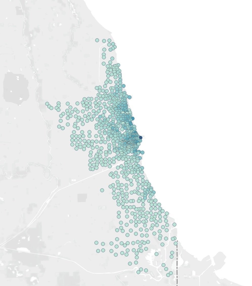
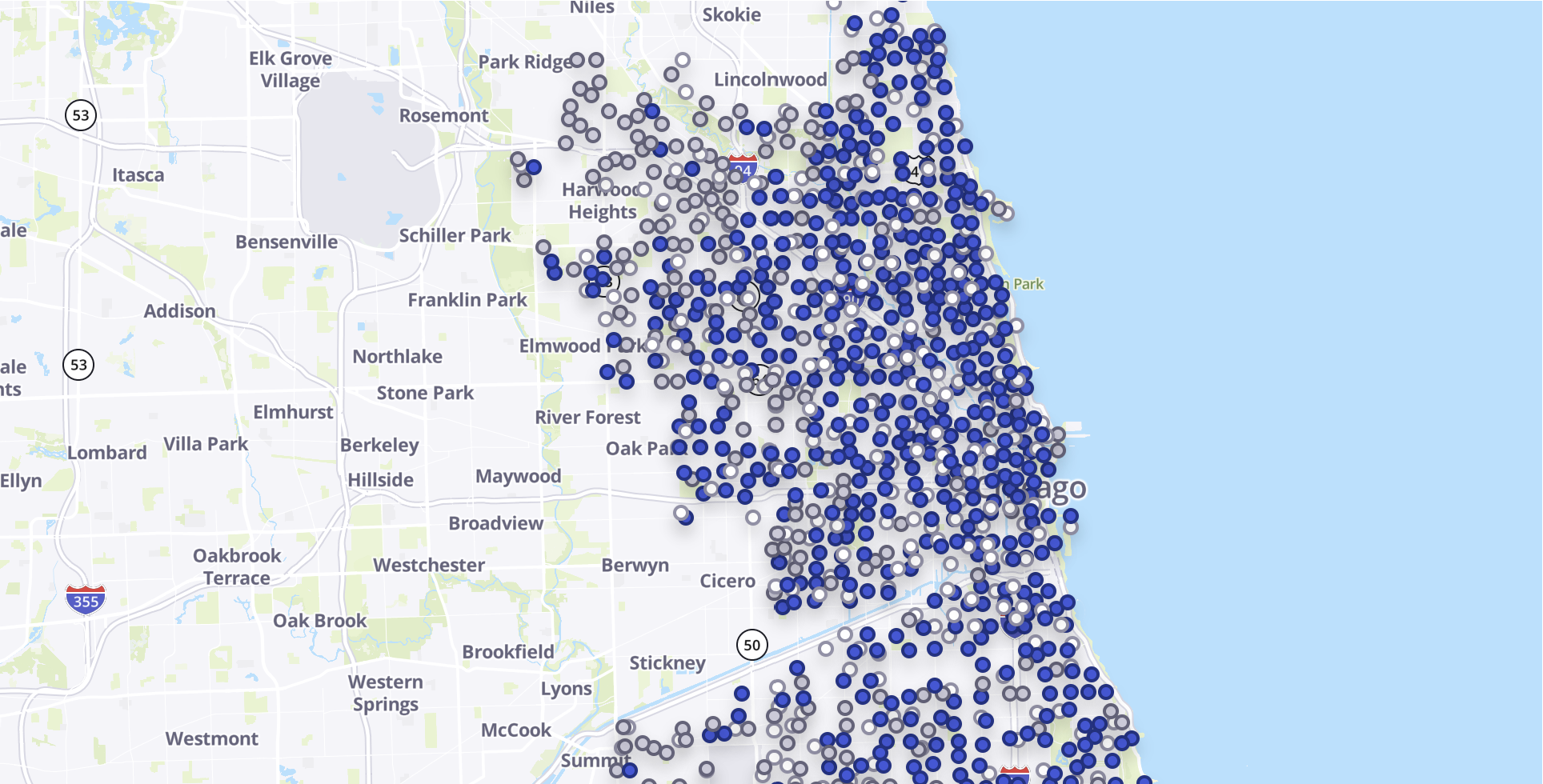
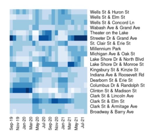
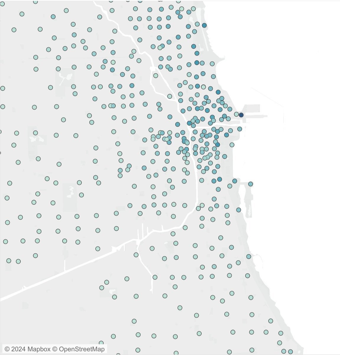
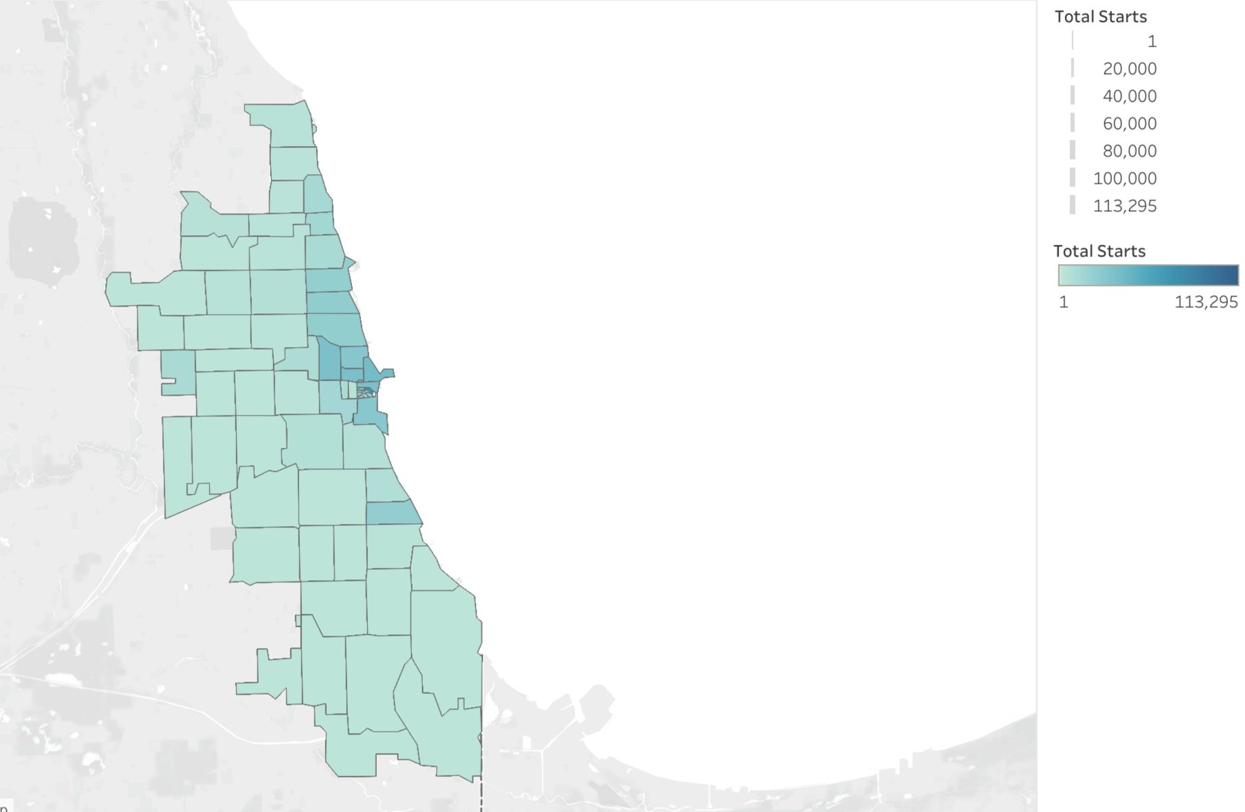
Visual-based, exploratory analysis seeks to discover connections and patterns in data. This category of analysis might not always answer questions, but it reveals interesting connections that lead to deeper investigation and understanding. In this way, exploratory analysis can be a good early step on a broad dataset that points analysts to other techniques. Visualizing data expresses stories that are unrecognizable when the data is in tabular form.

3. Creating Dataviz
The subsequent phase involved refining the visuals generated during the exploratory analysis into polished data visualizations, ready for presentation to the client.
DataViz #1: Daily average Divvy rides and Chicago Temperature (Fahrenheit)
DataViz #2: Daily average Divvy rides and Chicago Park District events
DataViz #3: Daily average Divvy rides and Chicago Transit Authority (CTA) rides
4. Presenting Information
Key Question:
Correlations between Divvy rides and key factors reveal demand signals and instances of low dock supply levels
This stage focused on helping us prepare and deliver the story we worked hard to create.
These visual aids effectively transformed our analysis of the Key Questions into a compelling data narrative, making the data easily understandable and engaging using the The McCandless Method.
DataViz #01 Narrative: The following analysis shows the correlation between the Divvy rides and key factors that impact the fluctuating demand throughout the year.
The first visualization illustrates the correlation between Chicago weather and Divvy bike demand. Gray bars represent average monthly temperatures, while the blue line depicts the daily volume trend of Divvy rides. Demand peaks during summer months, notably July and August, aligning with warmer temperatures conducive to riding. Monitoring weather forecasts could aid in inventory management at dock stations, ensuring optimal supply levels.
Additionally, major events in Chicago significantly influence demand, presenting another challenge to address.
DataViz #02 Narrative: This visualization demonstrates how consumers' utilization of Divvy for Park District events impacts bike demand.
This graph presents two years of comparative data, starting in September 2019. It contrasts Chicago Park District events, represented by the gray bars, with the daily average Divvy ride trend, shown in thousands by the blue line.
During this period, including the COVID-19 pandemic, public events consistently influenced Divvy bike demand. The graph illustrates a significant drop in Divvy demand in March 2020 following the government's shutdown of public events and major community institutions in Chicago. After the city lifted COVID-19 restrictions on June 11, 2021, Divvy bike demand increased.
Anticipating high Divvy demand around major public events is crucial. Therefore, operational efforts to rebalance bikes should prioritize Divvy dock stations near these event venues.
Additionally, the impact of other public transportation modes on Divvy ridership must be considered.
DataViz #03 Narrative: The following graph illustrates the comparison between CTA ridership and Divvy bike demand during and after COVID-19 restrictions.
In this visualization, the gray bars represent CTA rides data in millions, while the blue line depicts the trend of Divvy ridership over two years.
Before the pandemic, CTA ridership averaged about a million weekly. When Covid cases emerged in March 2020, ridership dropped significantly, especially after CTA services halted on May 31, 2020. This led to increased demand for Divvy bikes as commuters sought alternative transportation. Even after CTA services resumed on June 11, 2021, Divvy demand remained high. This trend underscores the potential for Divvy to attract and retain commuters, suggesting that ensuring the availability and supply of Divvy bikes could lead to the conversion of other commuters and casual riders into permanent Divvy members.
The data analysis highlights the correlation between these factors and Divvy demand. Proactively managing these signals can aid in effectively addressing bike rebalancing challenges.

5. Designing Dashboard
A dashboard was crafted for the Divvy Executive team, enabling them to rapidly monitor a set of Key Performance Indicators (KPIs) and recognize shifts in performance before their impact on Divvy’s business becomes significant.


